Give a visitor three clear options and they pick one. Give them thirty and many pick none. That pattern shows up on menus, pricing pages, navigation bars and product grids, and it has a name: Hick’s Law.
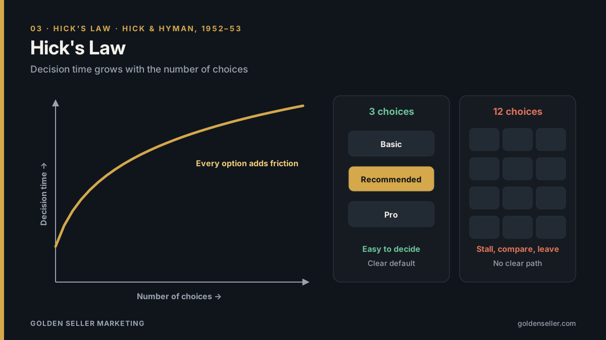
Hick’s Law says that the time it takes to make a decision increases with the number and complexity of the choices available. In online marketing, every extra option, link or button adds a little friction, and friction costs conversions.
What is Hick’s Law?
Hick’s Law, also called the Hick-Hyman Law, comes from experiments by British psychologist William Edmund Hick and American psychologist Ray Hyman in the early 1950s. They measured how long people took to react when presented with different numbers of possible signals. Reaction time increased as the number of choices increased, though not in a straight line: it grew roughly logarithmically, meaning each additional option adds a little less time than the one before.
The law applies most clearly to simple, comparable choices. It doesn’t mean fewer options are always better, but it does mean every option has a cost in attention and time.
Why Hick’s Law matters in online marketing
Online, people decide fast and leave faster. Choice overload shows up in several places:
- Navigation menus with dozens of links make it harder to find the one page that matters.
- Pricing pages with too many plans or features stall the decision.
- Landing pages with several competing calls to action split attention and weaken all of them.
- Product grids without filters or recommendations leave shoppers browsing instead of buying.
- Forms with many fields and options feel like work.
How to apply Hick’s Law
Give each page one primary action
Decide what the most important action is on each page (call, book, buy, request a quote) and make it visually dominant. Secondary actions can exist, but they should look secondary.
Simplify navigation
Group pages into a small number of clear categories. Use plain labels that match what customers call things. Move rarely used links to the footer.
Limit pricing tiers
Three plans is a common sweet spot: enough to compare, few enough to decide. Highlight the recommended option so people have a sensible default.
Use progressive disclosure
Show the essentials first and reveal details only when someone asks for them: expandable FAQs, “compare plans” toggles, multi-step forms. People make one small decision at a time instead of facing everything at once.
Curate and recommend
“Most popular,” “best for small businesses” and personalized recommendations reduce the choice set without removing options. Filters and search do the same for large catalogs.
Shorten forms
Ask only for what you need to start the conversation. Every optional field is another small decision.
Hick’s Law and branding
Brands suffer from choice overload too. A company that tries to be known for ten things is remembered for none. The strongest brands make the customer’s decision easy by being clearly the right choice for a specific need. That’s the core of brand positioning: narrowing what you stand for so choosing you takes less thought.
The same applies to product lines and service menus. Too many similar offerings make customers work to understand the differences, and confused customers often delay or go elsewhere. A focused lineup with clear names and clear differences supports both conversions and brand clarity.
When more choice is fine
Hick’s Law is a guideline, not a rule to minimize everything. Experienced users of a tool may prefer more options visible at once, and some shoppers enjoy browsing a large catalog. The goal isn’t fewer options for their own sake; it’s making the path to a good decision as easy as possible for the people you serve.
Common mistakes
- Removing options without testing. Simplify, then measure. Sometimes the option you cut was the one people wanted.
- Hiding important information. Simplicity shouldn’t mean customers can’t find prices, contact details or policies.
- Equal weight for everything. If every button looks the same, the page has no clear path.
Frequently asked questions
What is the Hick-Hyman Law?
It’s another name for Hick’s Law, recognizing both William Edmund Hick and Ray Hyman, whose experiments in the early 1950s established the relationship between number of choices and decision time.
How does Hick’s Law apply to web design?
It encourages fewer, clearer choices: simpler navigation, one primary call to action per page, limited pricing tiers and shorter forms. Our web design team applies it on every project.
Put behavioral psychology to work for your brand
Golden Seller Marketing is a San Diego digital marketing agency built on behavioral marketing: we use how people actually notice, decide and remember to shape websites, ads, content and brands. This article is part of our series on the 11 laws of human psychology every marketer should know. Explore our branding, web design and online marketing services, or contact us at (855) 853-3456.